

Ridge is a California-based winery specializing in single-vineyard wines, with each release reflecting the unique character of vineyards across the state. The goal of this rebrand was to honor Ridge Vineyards’ established identity while reconnecting the visual language of the brand to its heritage and homegrown roots.
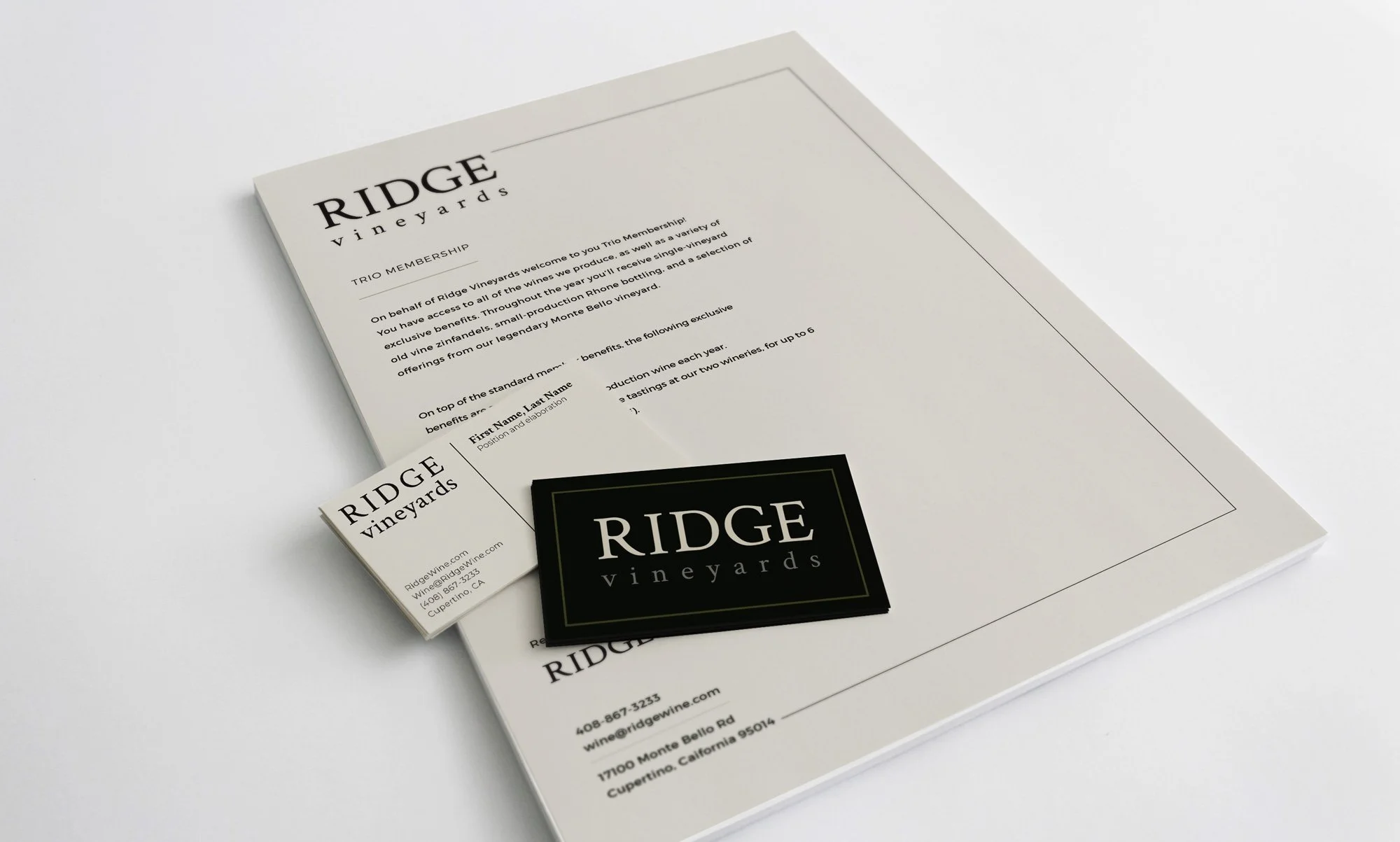
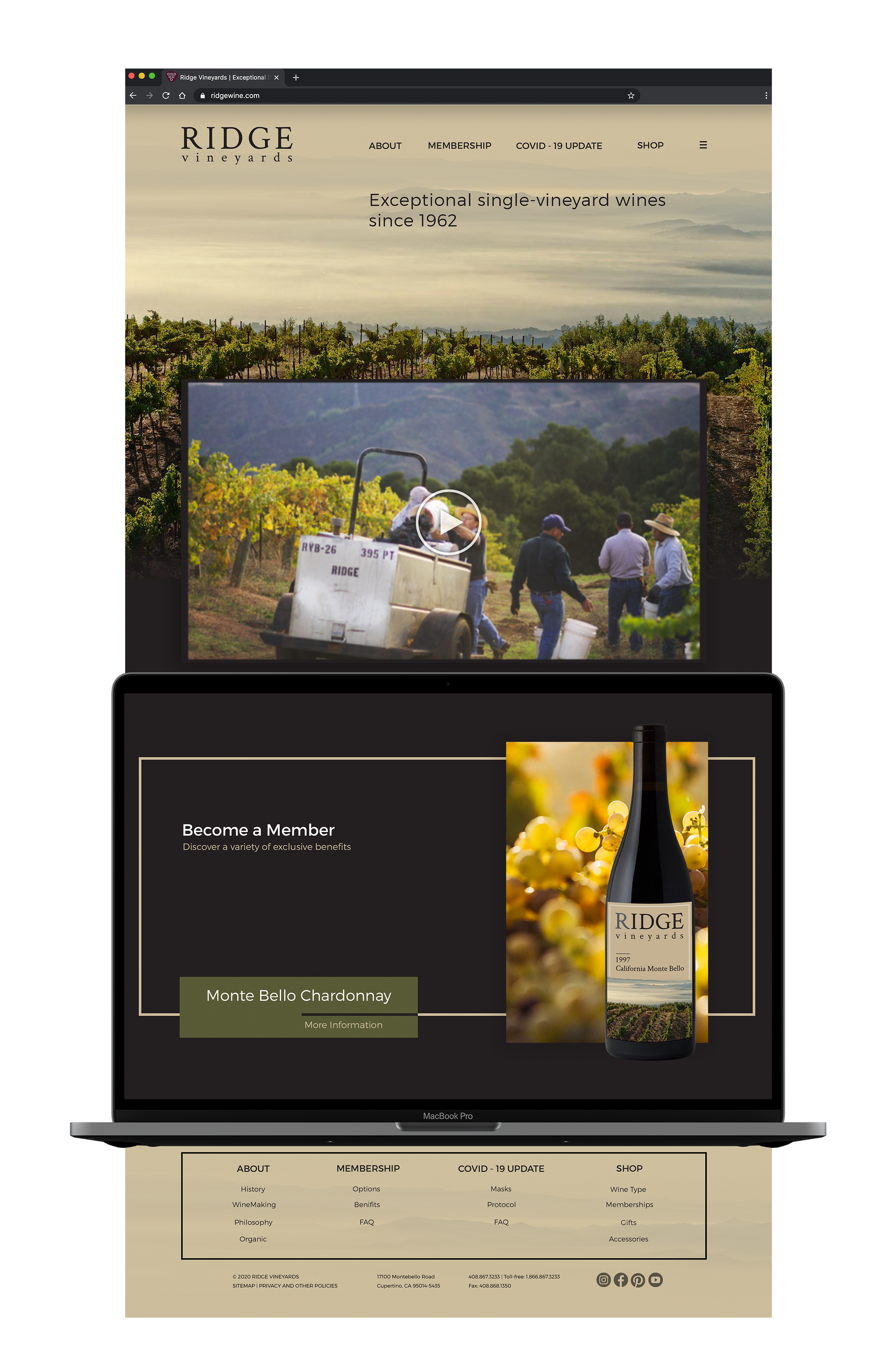
The updated system pairs a strong, confident logotype with documentary-style photography of the harvesting process and vineyard landscapes, allowing craftsmanship and place to take center stage. By emphasizing origin, process, and history, the rebrand positions Ridge as both authentic and enduring, supporting the reopening of in-person tastings and reinforcing the winery’s return to its physical locations.
The following project is a hypothetical re-brand created during my time studying in the course, Identity Systems.
logo iterations